
As the WNBA’s 25th season comes to an end, the NBA’s 75th is just beginning. Nike and the NBA have unveiled their City Edition uniforms for all thirty teams in celebration of the league’s bold highlight reel in sport and culture.
The City Edition jerseys comes with inspiration from the sport’s universality. Whether it’s a championship arena game or a neighborhood pickup, basketball is a language shared by many. The annual Nike NBA City Edition takes its theme from a city’s zip code and the effect on its fandom, as well as vice versa.
The 2021-22 iterations will still use the traditional geographic elements as its creative direction. However, it will act as a highlight reel of its own, showcasing major moments of each franchise. These include expansions, player performances, club titles, and much more. The basketball community is one that survives trend and tribulation, noted by Nike through this collection. Teams and their histories are glued together by the community, using this collection as a centerpiece.
Take a closer look at each team’s City Edition jersey below. They will be available for purchase on the NBA Store and nike.com on November 15th.
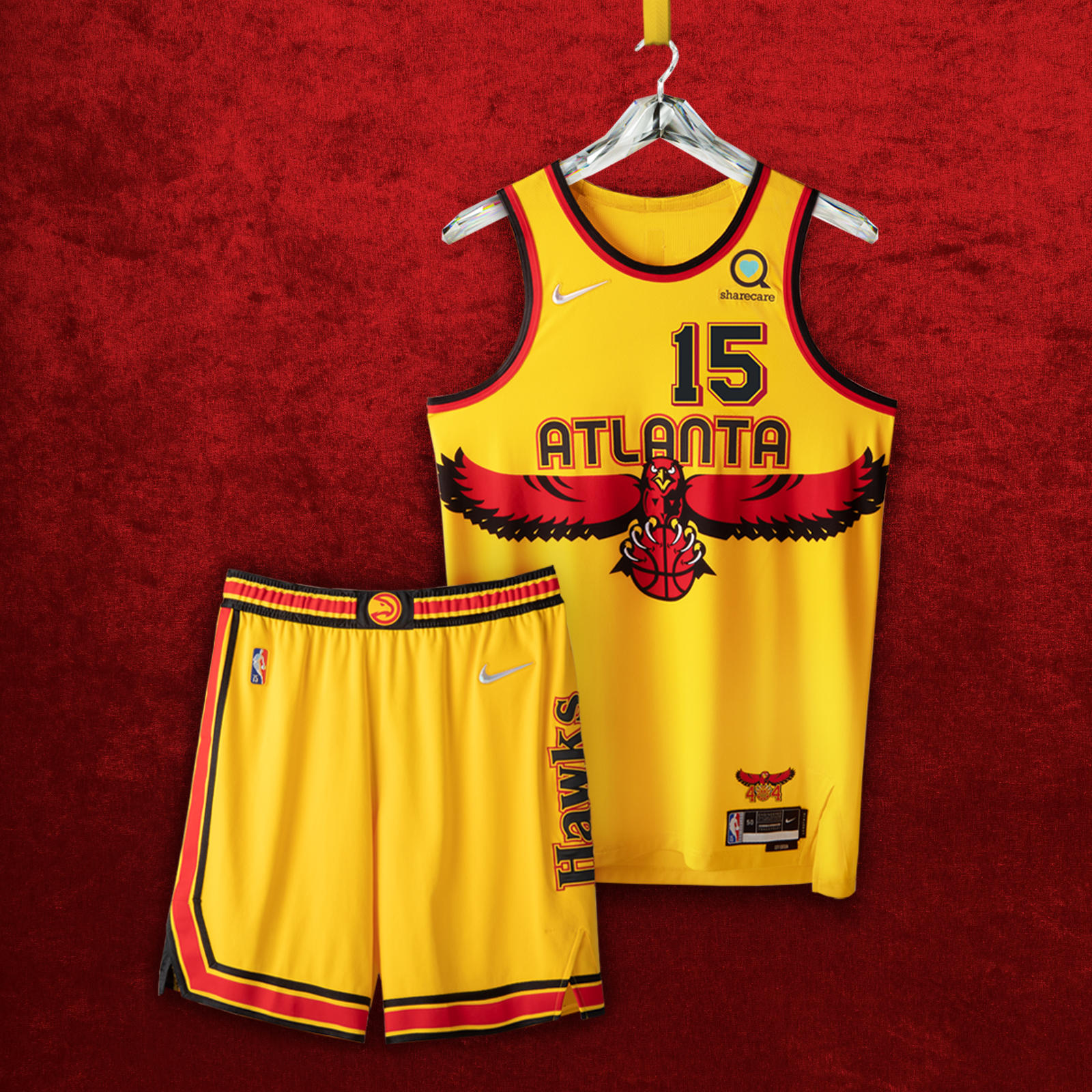 ATLANTA HAWKS
The front numbers and the stripe configuration on the shorts pay tribute to the first uniforms debuted in 1968, while the back numbers hearken to the highlight era of the ’80s. The wingspan logo of the ‘90s makes a bold return across the front, while the beloved Primary Icon logo goes front and center on the belt. And the jersey anthem calls out the city’s iconic “404” with the razor-talon Hawk.
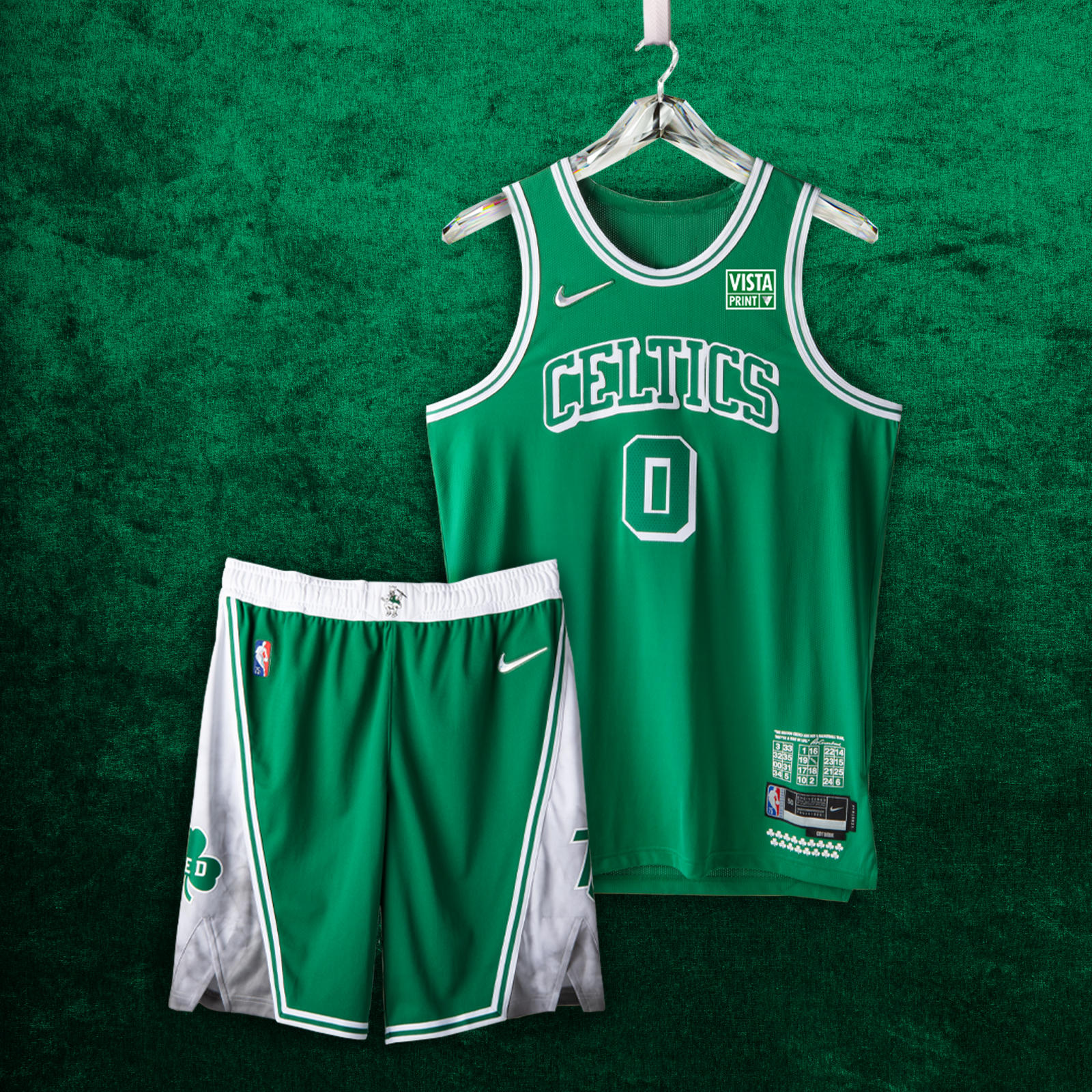 BOSTON CELTICS
It’s a tall task to pick a collection of greatest moments for your franchise when 17 championship banners hang from the rafters. The Nike NBA City Edition uniforms focus on lettering and striping details from the ’46 and ’49 Celtic teams, as well as some signature details (Lucky the Leprechaun returns) from the franchise’s untouched run in the ’60s.
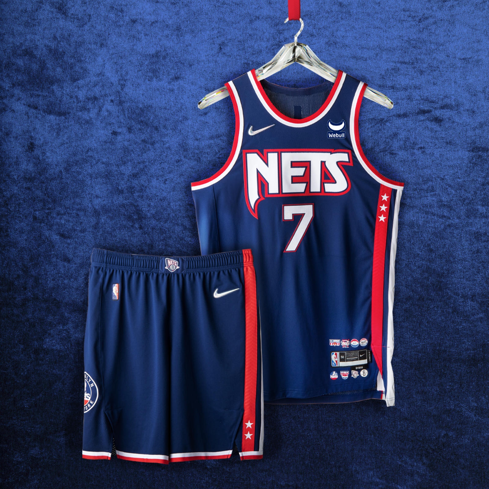 BROOKLYN NETS
Marking the team’s path from New York to New Jersey and back again, the argyle side panel is a tribute to the repeat Eastern Conference championships from the ’01-‘02 and ’02-‘03 seasons. The patch on the shorts is a throwback to the ’80s, while the red, white and blue color blocking reaches back to the franchise’s ABA roots. On top of the navy body color, the black space symbolizes a team on the rise, poised to leave a new mark on the league.
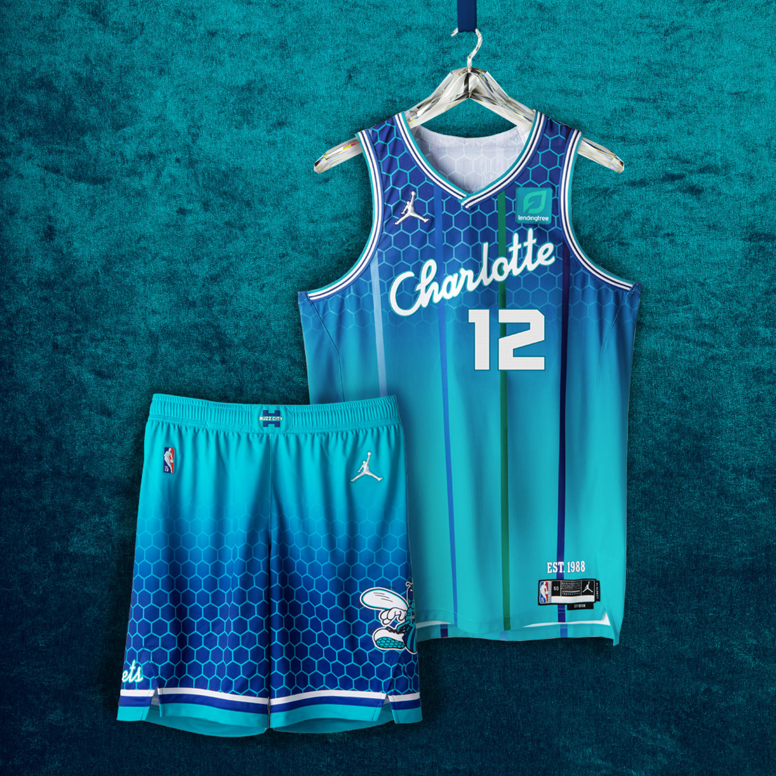 CHARLOTTE HORNETS
The “Charlotte” script wordmark has never been used on a Hornets uniform, a detail calling to mind the unveiling of the team’s original uniforms in 1988. On the front of the jersey, the numbers are styled in the way of the current Hornets font, right justified on the front as a throwback to the Bobcats jerseys from ‘04-’09 and ‘12-’14, and the player name on the back honors the classic Hornets font. The iconic pinstripes return in purple, green and blue, commemorating the first team in league history to wear them on a jersey. The shorts bring back the original Hugo design from the team’s founding year in 1988.
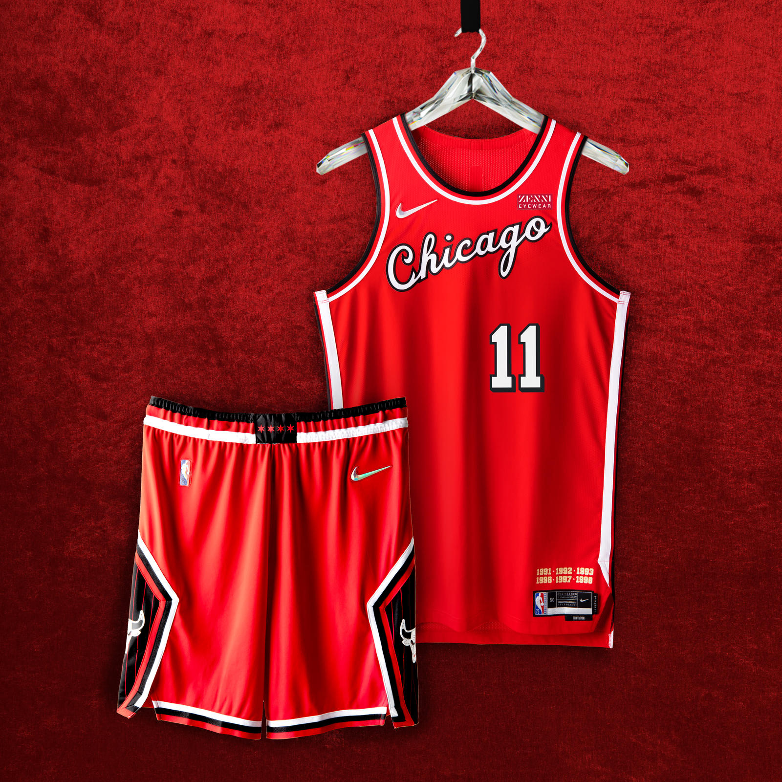 CHICAGO BULLS
The unforgettable script from the Bulls’ debut ’66 season graces the jersey chest. Two callouts to the team’s three-peats cover the area above the jock tag. The four stars of the city’s flag stud the belt buckle, while on the diamond cutout of the shorts, a black pinstripe pattern hearkens back to the team’s second three-peat.
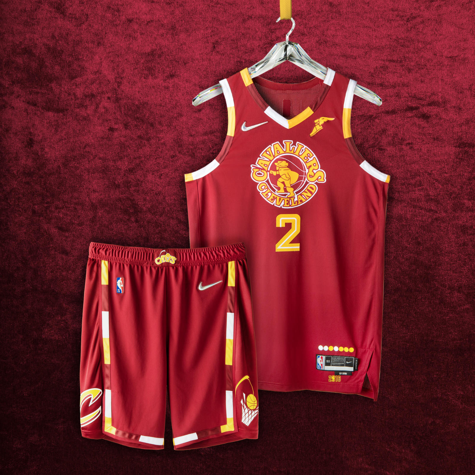 CLEVELAND CAVALIERS
The uniforms are styled in the franchise’s classic crimson and gold, a pattern that honors the return of the team’s swashbuckling swordsman from the ’70s and the Miracle at Richfield. The jersey pays tribute to the ’16 championship season, and the legendary comeback that brought the city its first title in generations. The shorts rep the Cavs logo from the ’80s and ’90s playoff runs on one leg, and the logo from the historic ’16 season on the other.
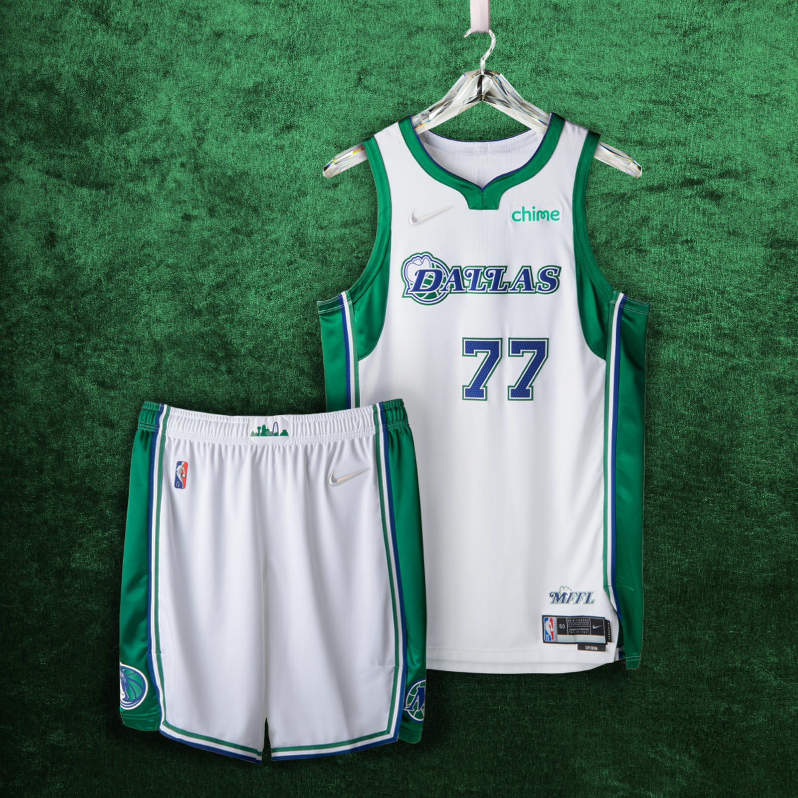 DALLAS MAVERICKS
Although the City Edition uniform brings back the green accents and western-style typography of the franchise’s early years, this season is the first time that a cowboy hat is set on top of the Dallas wordmark. The shorts include the style of cowboy hat featured graphically from the team’s first 20 years, the horse from its second 20, and a belt buckle with a giant Texas skyline.
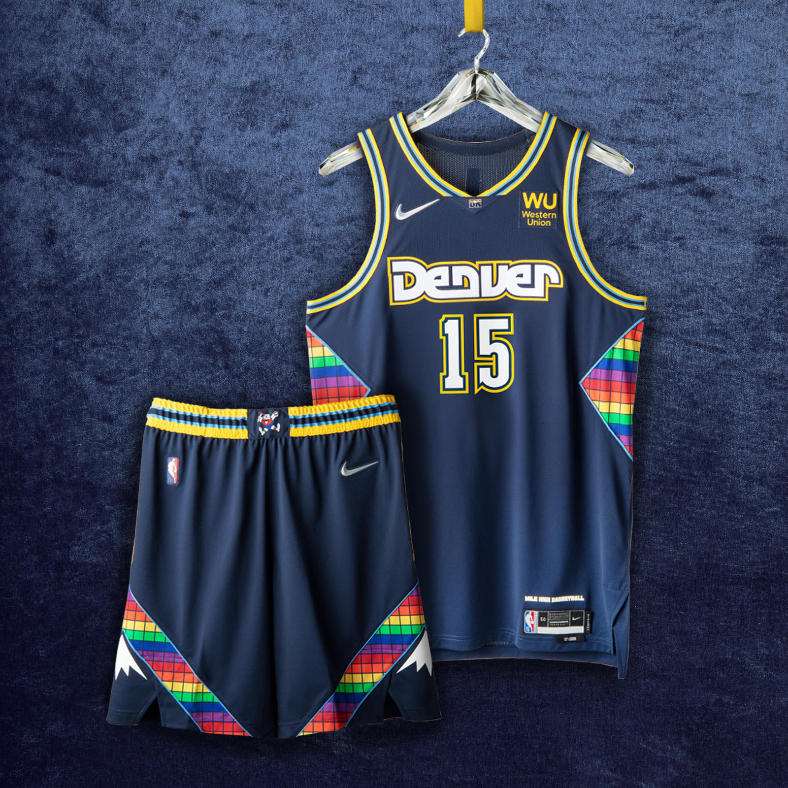 DENVER NUGGETS
Uniform details from the team’s fast-breaking game play of the ’80s and its shocking postseason run in ’94 make their way into this year’s City Edition jersey. A shimmering rainbow tetris pattern returns on the side paneling, the shorts and the neckline. Maxie the Miner, the team’s original mascot, appears on the belt buckle. The number set stretches back to the ’93-’94 to ’02- ‘03 uniforms. The diamond insert is a tribute to the identity of the ’75–’76 ABA team.
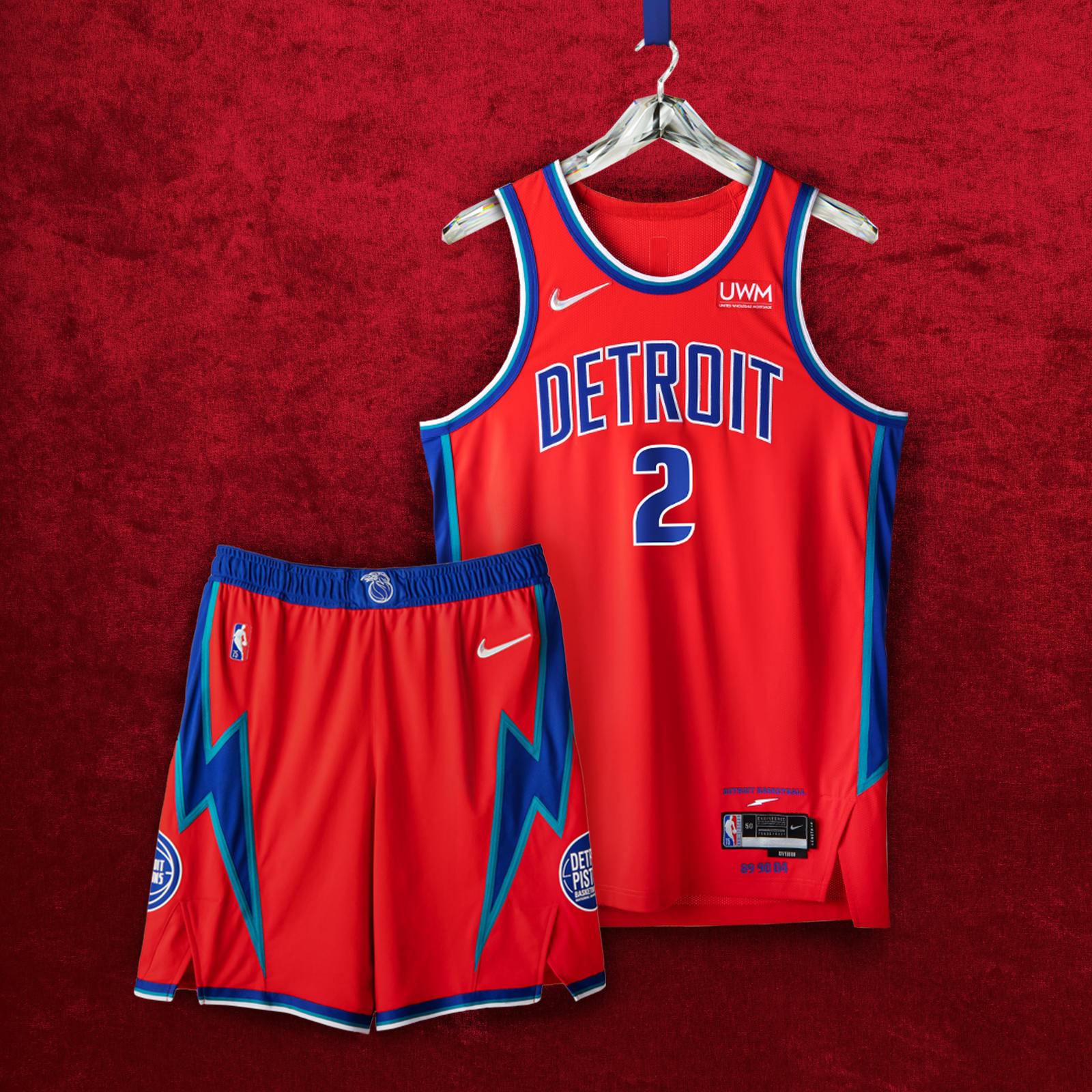 DETROIT PISTONS
The jersey proudly displays “Detroit” across the chest set against accented teal, royal and white arm taping. The side paneling is a nod to the Pistons squads of the mid to late ’90s. Both the Pistons’ former and current patches are featured on opposite sides of the shorts and are set against lightning bolt strikes, reminiscent of the team’s late ’70s aesthetics. The color-block waistband is a remix of the classic flaming horse logo and the ’90s era graphics.
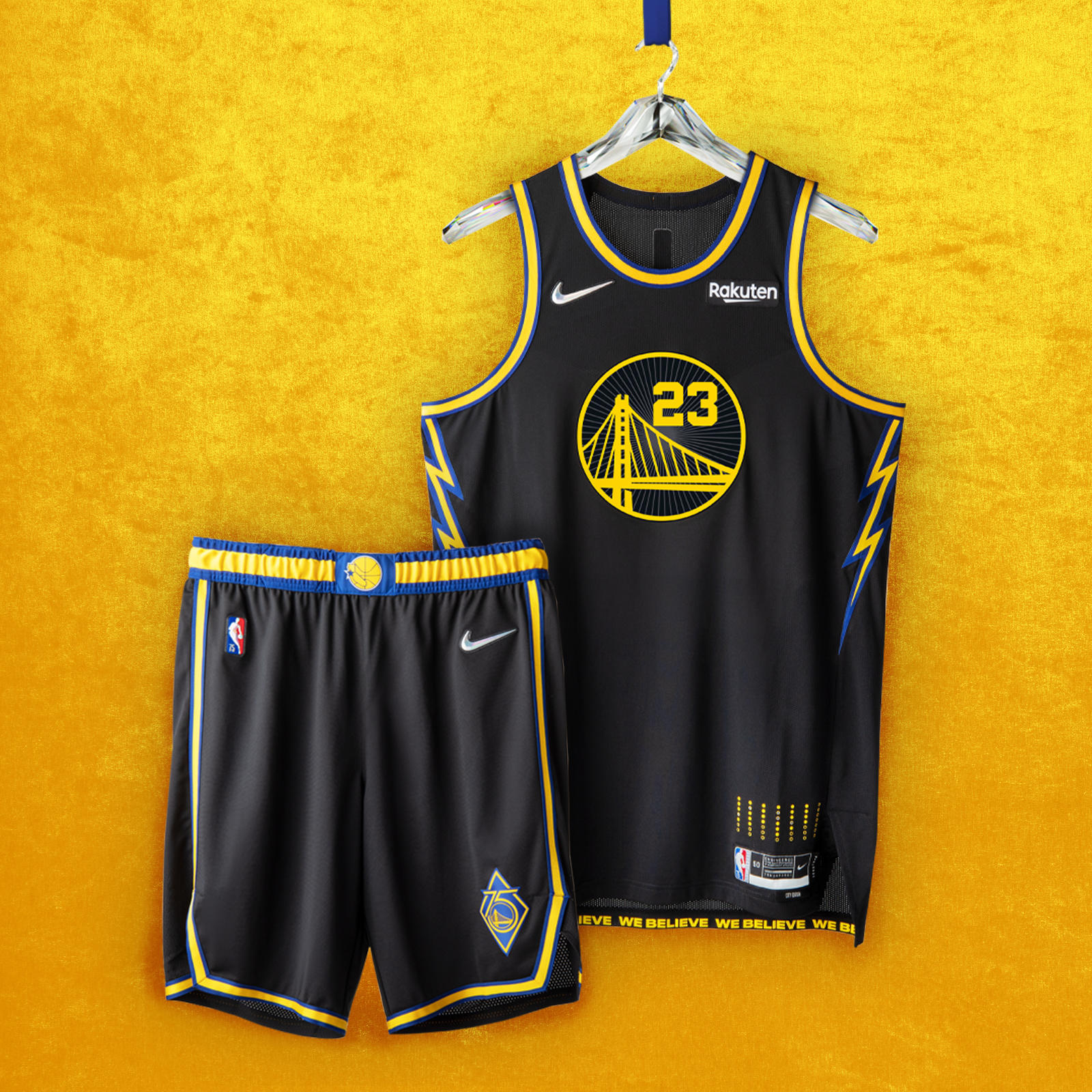 GOLDEN STATE WARRIORS
The uniform’s inspiration began with Oakland, the team’s home for nearly 50 years. Based in black, the Bay Bridge logo is surrounded by a design representing the roof of the team’s former arena. As a tribute to the We Believe Warriors of the late 2000s, lightning bolts line the uniform’s side panels. The shorts are embellished with a golden trim and feature two logos: one from the We Believe era, and the other marking the Warrior’s 75th anniversary.
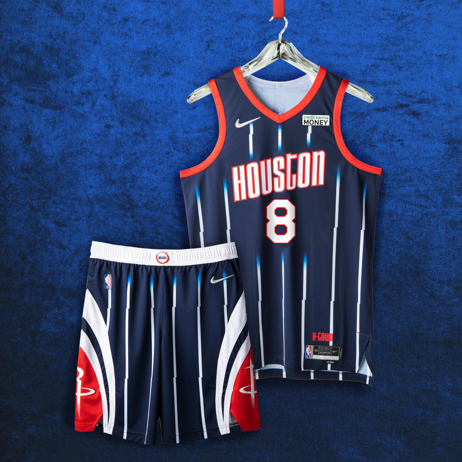 HOUSTON ROCKETS
The uniform’s style is inspired by the mid ’90s jerseys, with white pinstripes fading into navy continuing to the shorts. The belt buckle features the team logo from the Clutch City championship years of ’94 and ’95. The two logos, pulled from the 2000s, mark two moments: one for Houston’s No. 1 draft pick, and the other from the team’s memorable 22-game winning streak.
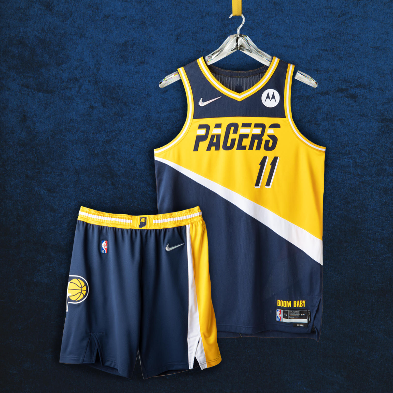 INDIANA PACERS
Front and center is the Pacers jersey wordmark from 1987 surrounded by the famous yellow color blocking. More details on the lining and the side paneling pay tribute to the team’s legacy, such as the three ABA championships in the early ’70s and its 2000 Eastern Conference Championship. The shorts include the team’s current logo remixed with the classic look from 1971.
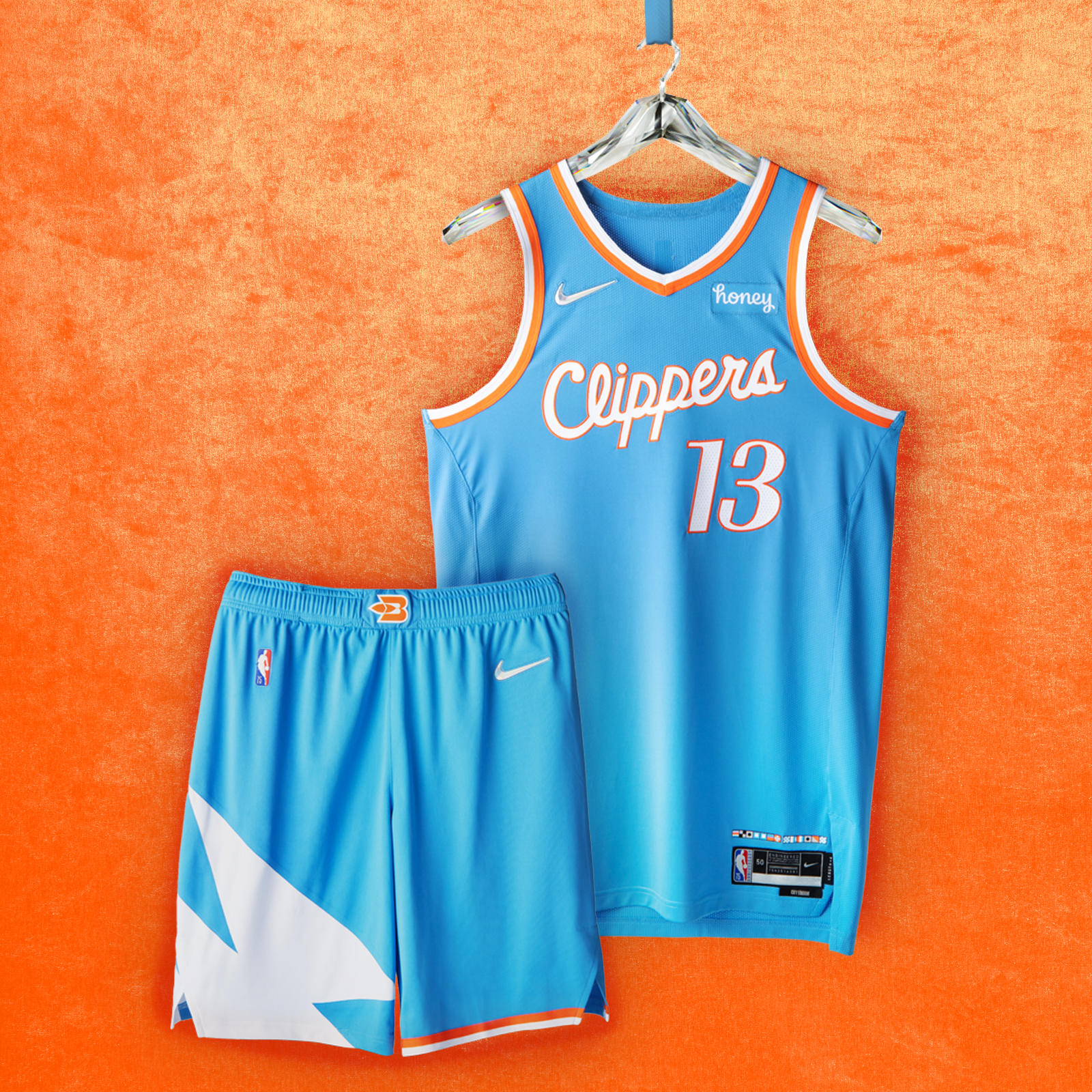 LA CLIPPERS
The uniform has a Pacific blue base color that was inspired by the team’s past incarnations as the Buffalo Braves and the San Diego Clippers. The jersey numbers and taping on the neck, arms and shorts are a tribute to the 1984 uniform design, marking the team’s first season in Los Angeles. The memorable Clippers script wordmark is from the 2015-16 season, linked to its high-flying roster. The uniform’s shorts feature the three white sails that were part of the original Clippers logo design, and part of the team’s first Nike NBA City Edition uniform in 2017-18.
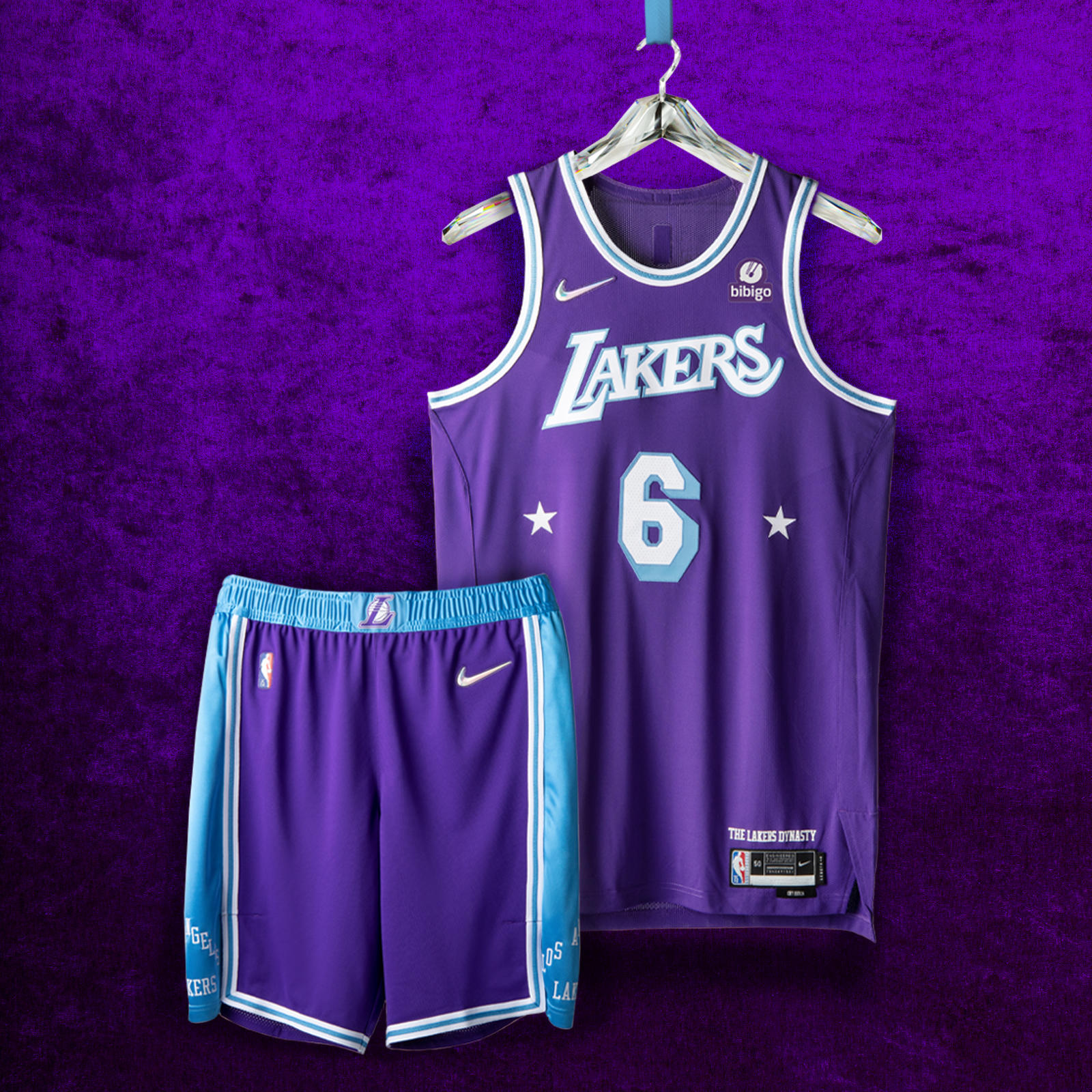 LOS ANGELES LAKERS
While the shorts incorporate the baby blue from the original championship team in Minneapolis, the primary head-to-toe color is the Lakers purple that emerged in the late ’60s. The belt buckle includes the “L” logo from the three-peat era of the 2000s.
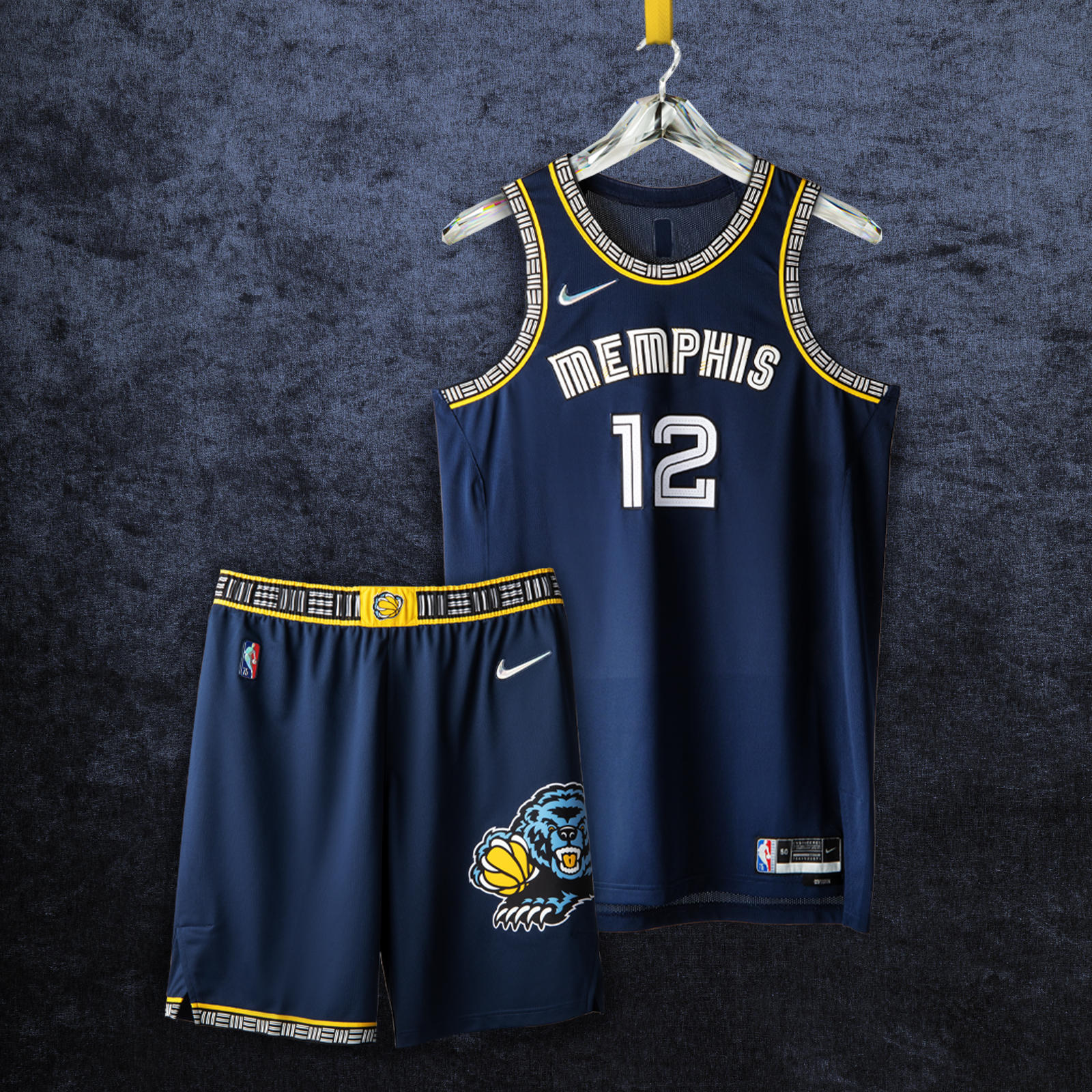 MEMPHIS GRIZZLIES
The uniform brings in details from throughout the team’s far-reaching background, from British Columbia to Tennessee. The uniform’s main colors are the midnight blue and yellow that have represented the Grizzlies style since 2004. A stylized “Mem” wordmark from 2018 patterns through the neck, arms and shorts in a design similar to both the original Vancouver uniform and the current Statement Edition uniforms. The waistband has the “claw ball” logo drawing from the original design from Vancouver and those early Memphis years. The shorts have the iconic bear logo from 2002 updated with the current blue colorway.
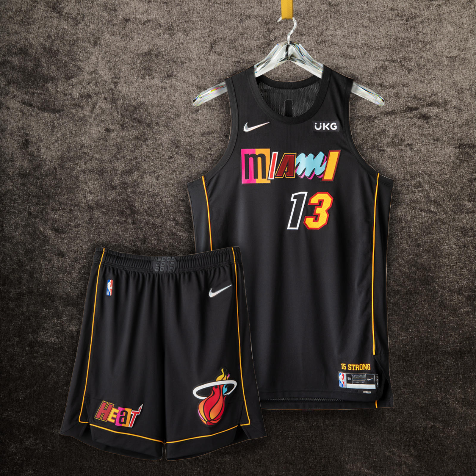 MIAMI HEAT
This is a mash-up in the truest sense of the word, comprised of a collage of letters and numbers from the franchise’s most iconic jerseys. The black base is a neutral foundation for the letters pulled from uniform sets like the technicolor Vice Nights jersey, the Miami Floridians jersey and others. Just above the jock tag appears “15 Strong,” referring to the team’s 2006 championship run. Rounding out the uniform is a thin golden stripe that symbolizes the security ropes brought out by arena staff seconds before the thrilling Game 6 shot in 2014.
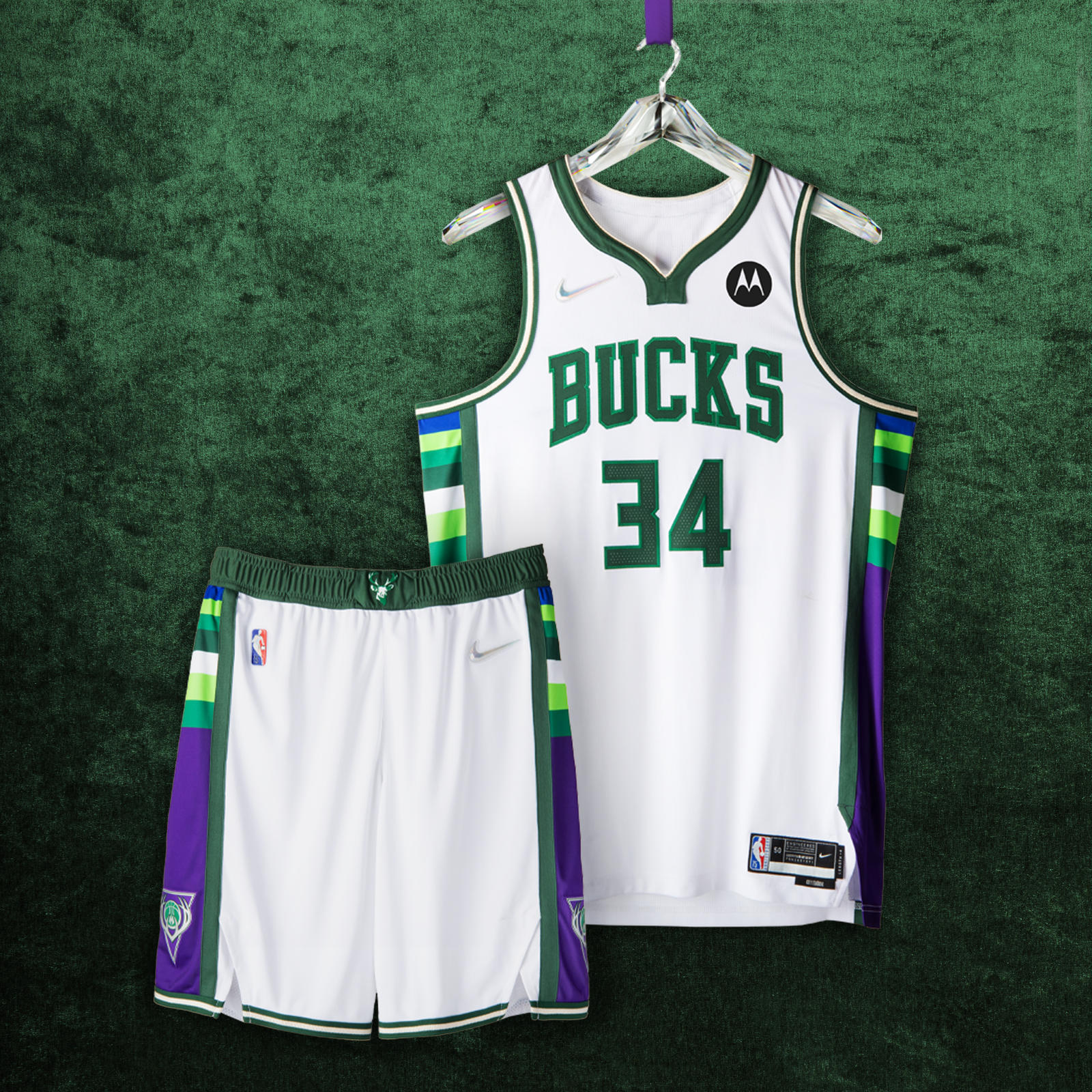 MILWAUKEE BUCKS
The uniform features green and Lake Michigan blue from the team’s current uniform sets, side panel blocking from 2001, the neckline from the 2010s, and the number set worn by the team during its second championship in 2021. A remixed waistband logo from 1971 is a callback to skyhooks and triple-double averages.
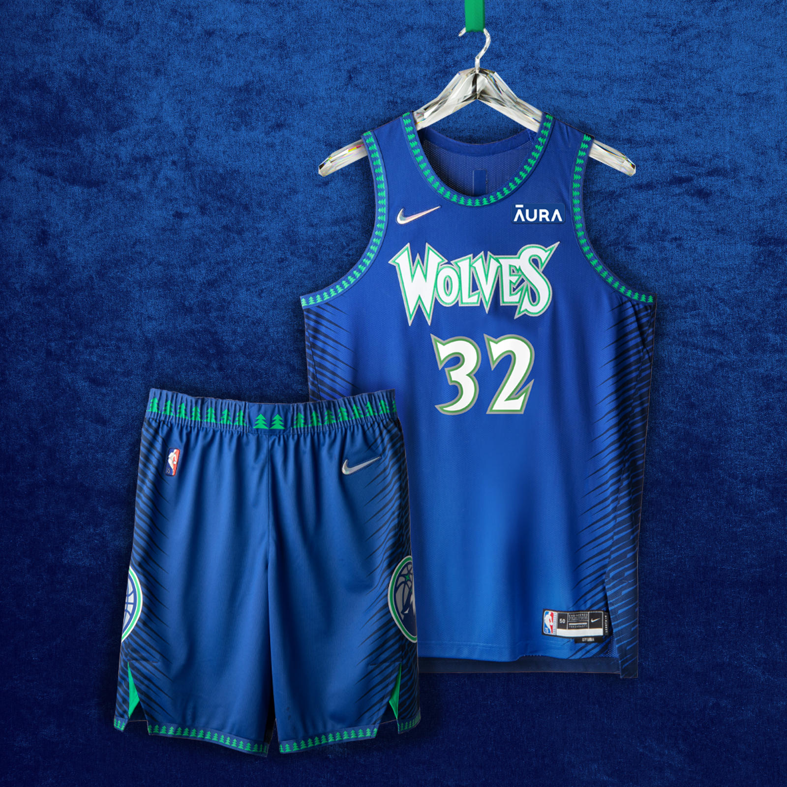 MINNESOTA TIMBERWOLVES
The blue, green and white color palette of the uniform returns from the team’s inaugural 1989 season. The wolf logo reflects the origins of the team, while the wordmark and forest images are inspired by the MVP-era early 2000s. Each side of the short is equipped with guard hair patterns to capture the essence of the wolf as well as resurface themes from the inaugural 2017-18 Nike NBA City Edition uniform.
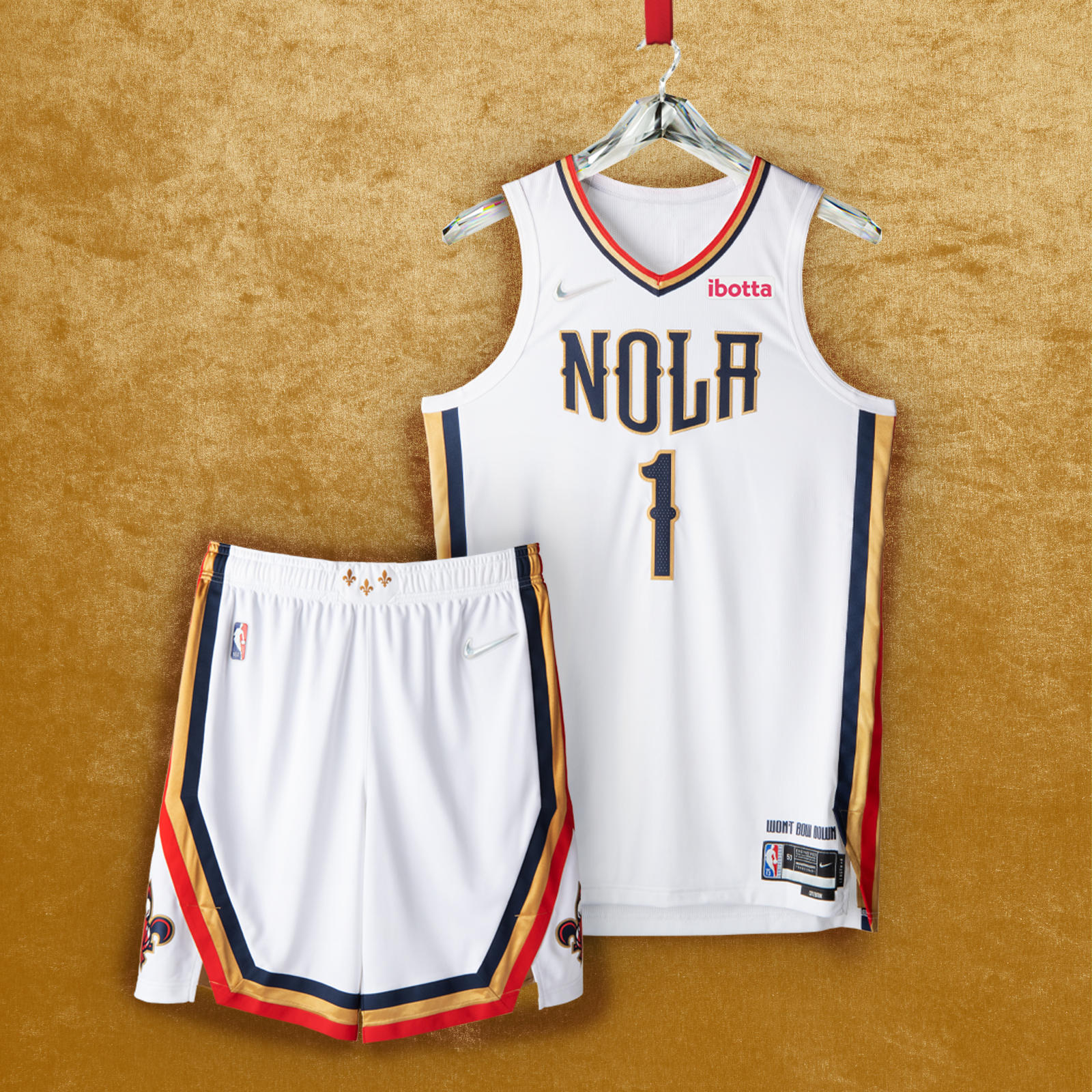 NEW ORLEANS PELICANS
Inspired by the resilience of the city, the uniform combines a white base with typography reminiscent of wrought iron. It also boasts red, gold and navy stripes, as well as the signature “NOLA” emblem, iconic fleurs-de-lis on the belt buckle in Mardi Gras gold, and an anthem that defines the team and its city: “Won’t Bow Down.”
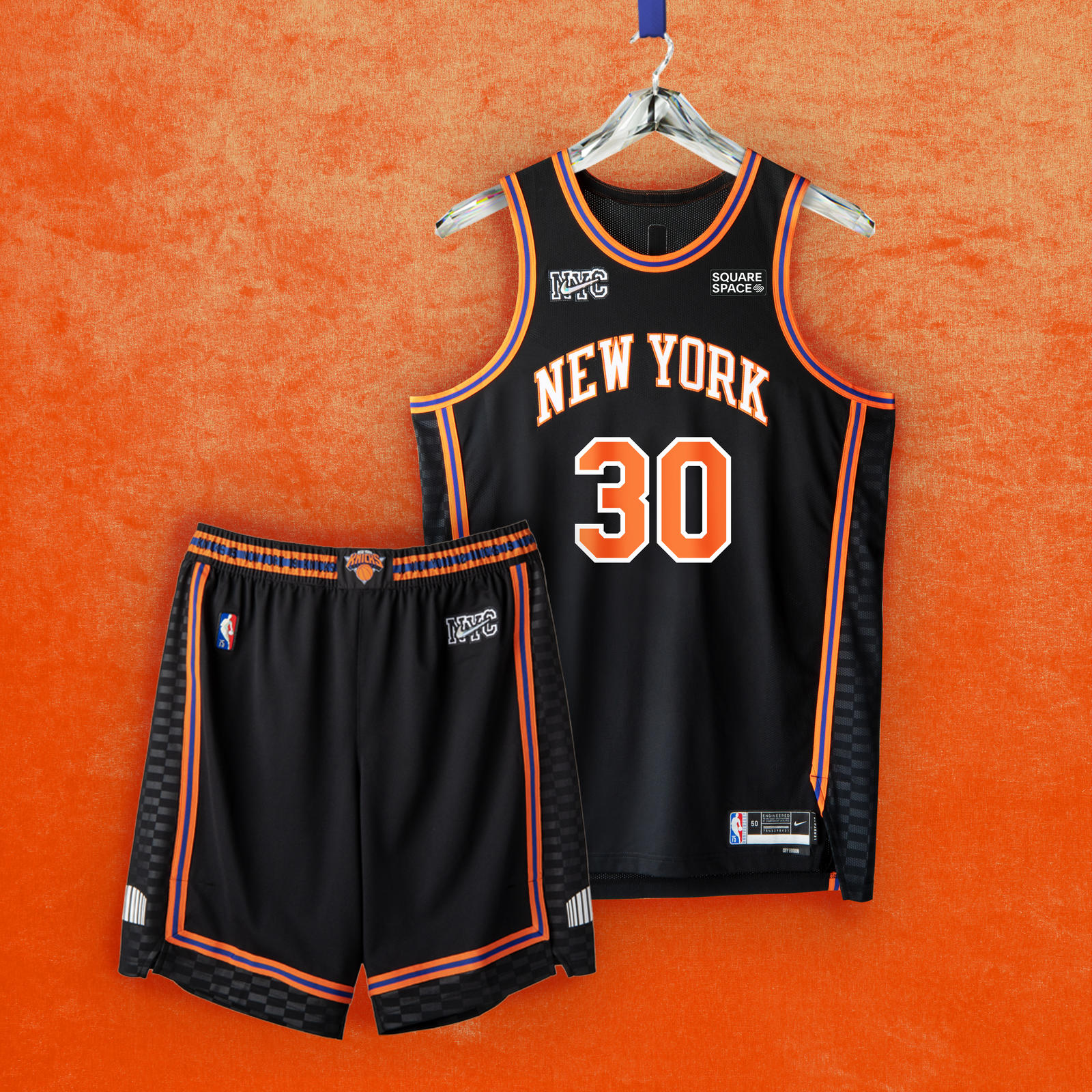 NEW YORK KNICKS
The black uniform features orange and blue piping and checkered side panels. A graphic treatment of the team’s world-famous arena is shown on each leg, while the belt buckle boasts the logo that defined the team in the 2000s. The shorts carry retired Knicks numbers along the waistband. The Knicks iteration was also designed by Kith.
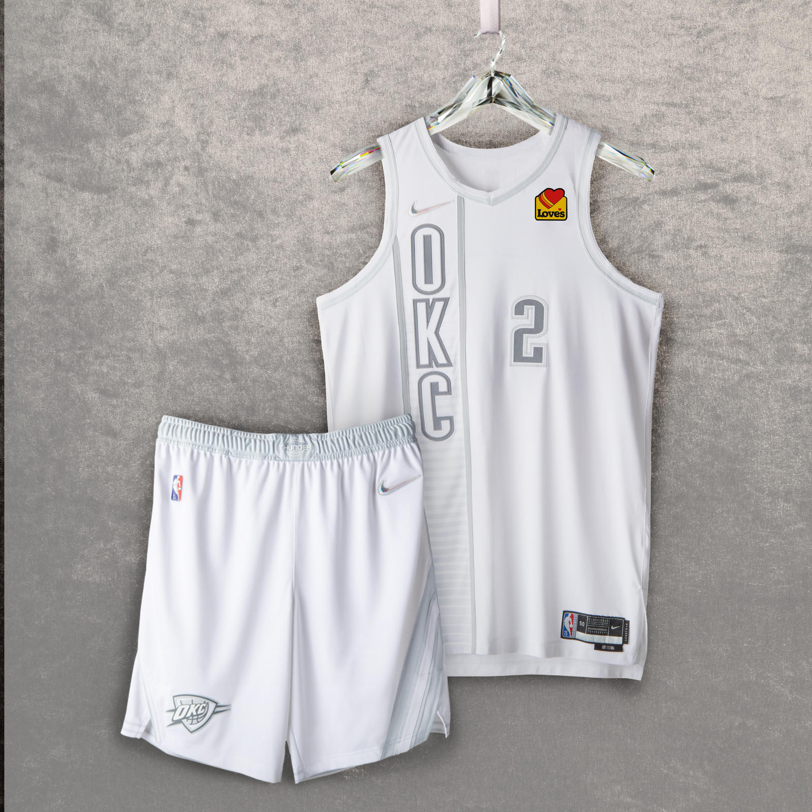 OKLAHOMA CITY THUNDER
Atop a white base, the uniform brings back the vertical lettering from the Thunder’s first alternate uniform, worn from 2012 to 2016. Also returning is the team’s belt buckle graphic from its first practice uniforms. Additionally, the sash detail on the shorts from the 2018-2019 Nike NBA City Edition uniform honors Oklahoma’s indigenous culture.
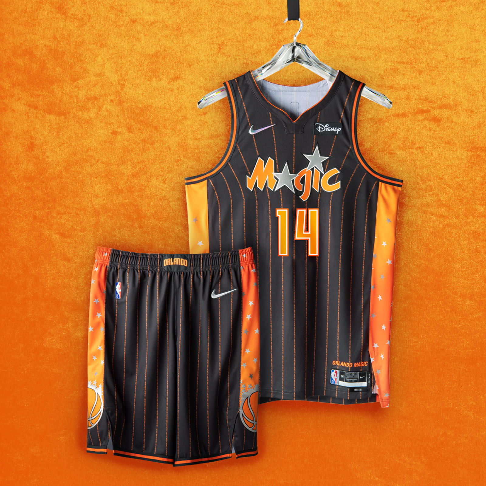 ORLANDO MAGIC
The uniform includes orange and anthracite detailing to recognize the orange groves that helped build the city’s economy, while the neck and arm taping are throwbacks to the team’s original jerseys, with the side insert featuring the first Orlando Magic logo. Two questions that typified the ’90s-era teams — “Why Not Us?” and “Why Not Now?” — are printed up and down the jersey in the form of pinstripes.
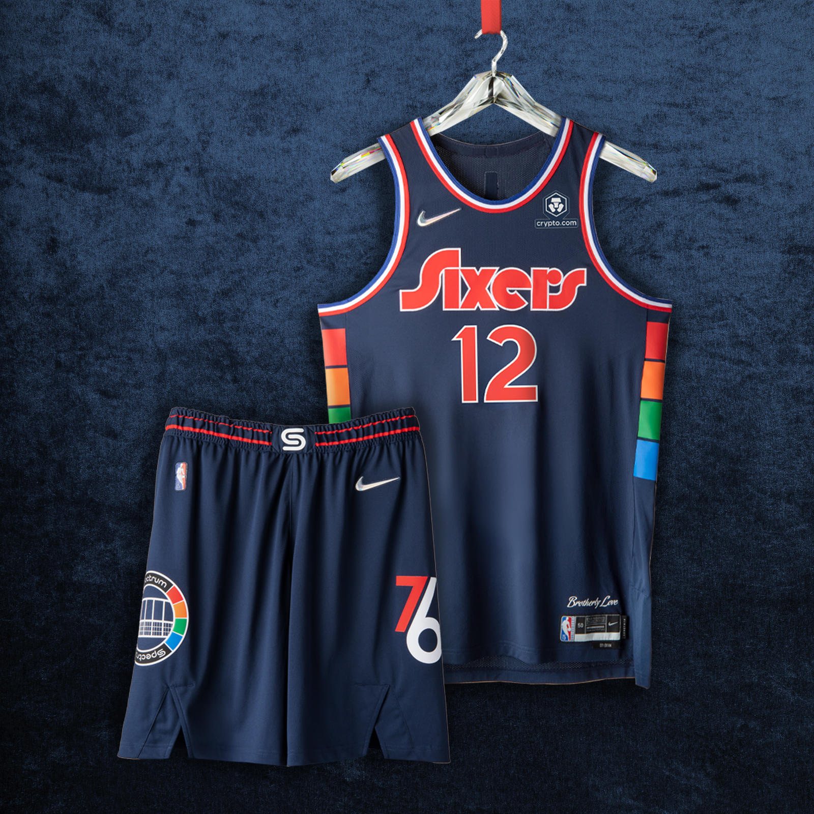 PHILADELPHIA 76ERS
The team’s 40-year relationship to its home arena is celebrated by the arena’s logos on the shorts and the belt buckle. The arena’s signature multicolor pattern runs up the sides of the jersey. The deep blue body color is a deeper version of the team’s royal blue, while the wordmark, numbers and player names are inspired by the team’s graphic identity from the late ’70s.
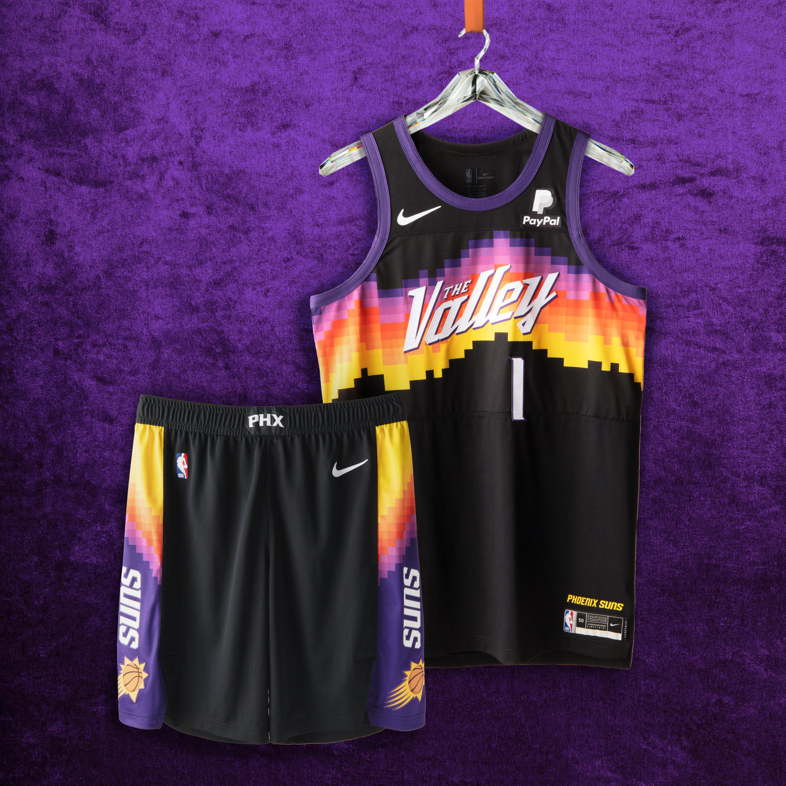 PHOENIX SUNS
The Nike NBA City Edition design from the 2020-21 season is inspired by the Valley’s breathtaking scenery, using stark colors and pixelated, abstract lines to create the local geographic landscape. The horizontal striping across the chest uses a spectrum of color to create the hues for Arizona sunsets and sunrises. The classic Sunburst logo returns on the short, while the “PHX” acronym appears on the waistband.
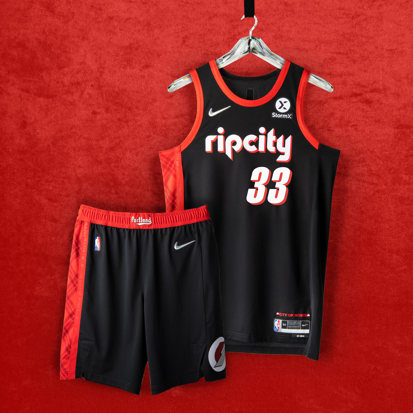 PORTLAND TRAIL BLAZERS
“Rip City” appears in the retro ’90s-style font with drop shadow. The belt buckle features “Portland” in the ’70s-style font from the original Blazers teams. A signature plaid pattern is a nod to a memorable feature of the city’s culture and also honors an all-time coach. A “City of Roses” anthem is a tribute to the city that supports its team.
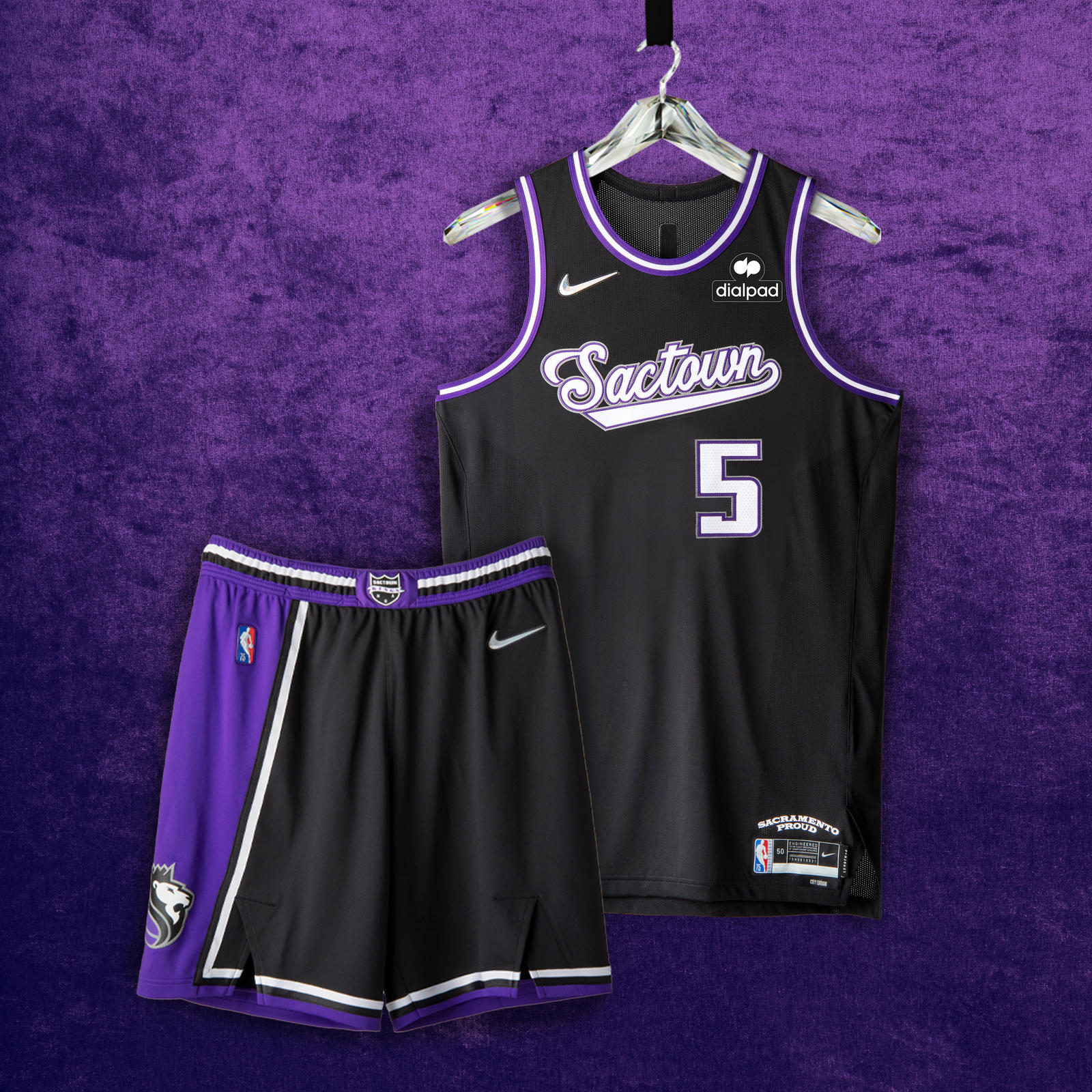 SACRAMENTO KINGS
An asymmetrical stripe over the black base is an ode to the “Greatest Show on Court” teams of the early 2000s. The script wordmark is a staple of the team’s design, as it’s been part of the team’s history from Kansas City to its permanent home in Sacramento. The waistband features a remixed version of the Rochester Royals logo set in purple and black.
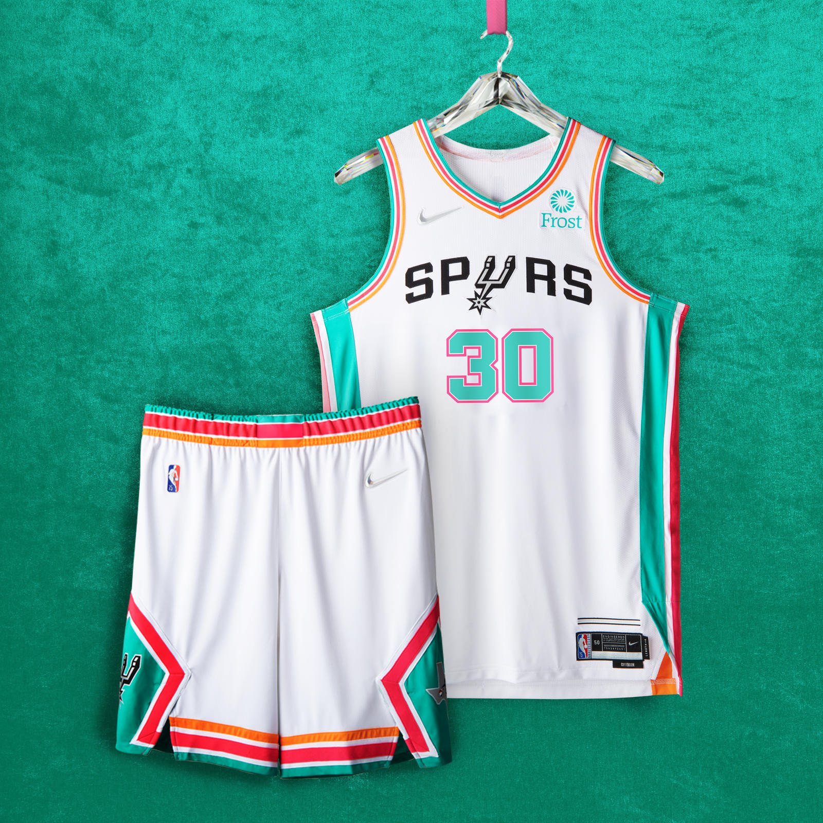 SAN ANTONIO SPURS
Lining the entire uniform are the franchise’s fiesta stripes, which first appeared on the team’s warm-up jerseys in the mid ’90s. Classic silver and black stripes appear above the jock tag. The shorts feature the boot-spur logo and the angular design of the jerseys worn by the team in the late ’70s and early ’80s, while also bringing back the roadrunner logo of the Dallas Chaparrals, the franchise’s original ABA name.
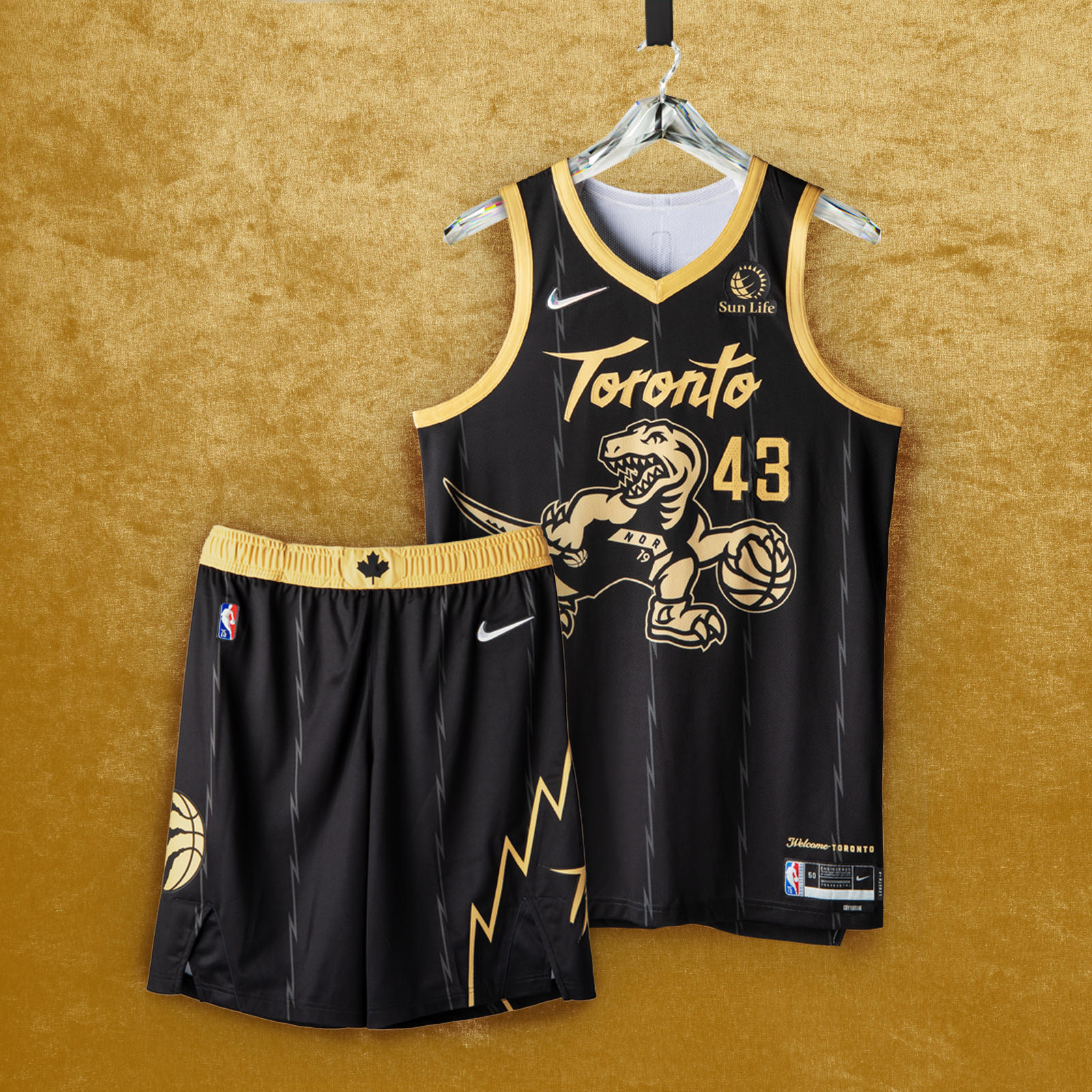 TORONTO RAPTORS
The popular black base and gold trim return, with the iconic dino logo, scrawled across the chest, donning the look from the 2019 title-winners and flipping the Raptor’s direction from the Nike NBA Hardwood Classic uniform. The jagged pinstriping and short design echo the team’s inaugural uniforms from a quarter-century ago. Today’s claw-scratch logo appears on the shorts, with a Canadian maple leaf on the waistband reminding fans of the team’s roots.
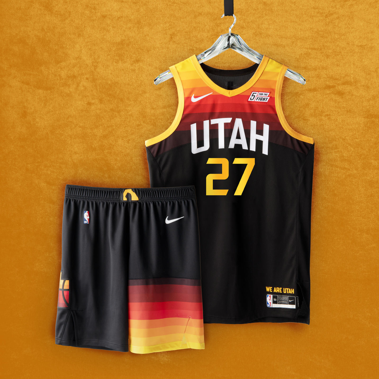 UTAH JAZZ
The Utah Jazz Nike NBA City Edition design from the 2021-21 season is the evolution of the gradient red-rock theme of the team’s original City uniform. The predominantly black uniform features simplified color bands strikingly positioned on the top half of the jersey and the left leg of the shorts. The asymmetry of the color bands on the shorts are an homage to the late ’90s uniform, which featured a mountain range on the left leg. The Jazz/state logo — representing how the Jazz belong to all of Utah — is featured on the right leg of the shorts. The Delicate Arch graphic appears on the waistband.
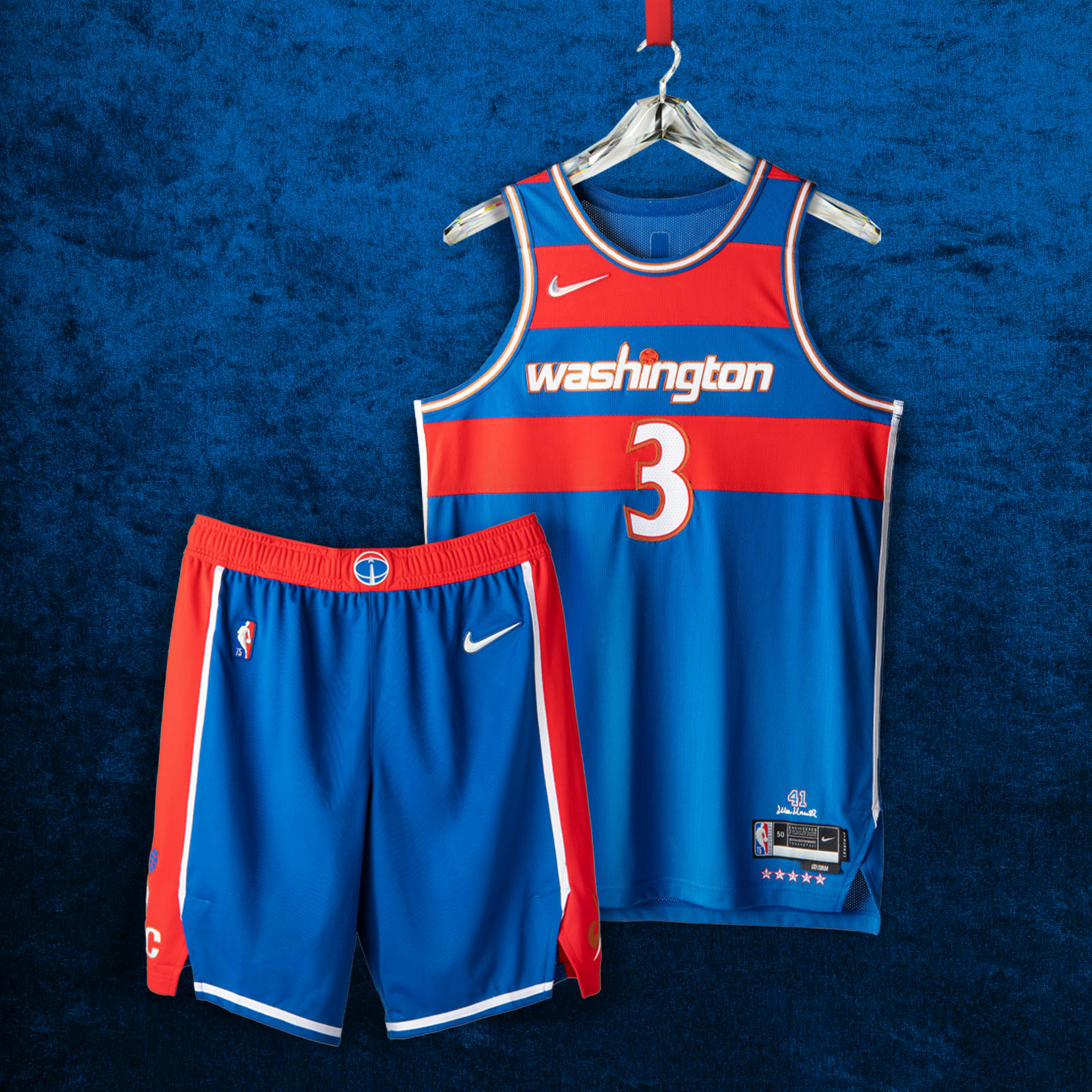 WASHINGTON WIZARDS
The red stripes on the blue base are a tribute to the classic Bullets uniforms from the ’60s and ’70s, especially from center Wes Unseld’s exceptional ’68 season, when he won both league MVP and Rookie of the Year honors. Below the red belt, the shorts feature a wide red panel on each side, a detail also brought back from the late ’60s. The “Washington” wordmark across the chest is a remixed take on the jerseys that highlighted the team’s inspiring playoff run during the 2016-17 season.
[…] post Nike & NBA Unveil 2021-22 City Edition Uniforms first appeared on […]